
UNIQLO
HONG KONG & Taiwan
DURATION.
Jun 2023 – Aug 2024
TOOLS.
Hands | Radica | Visual Studio Code | Figma | Illustrator | Photoshop | Zoom | Excel

BACKGROUND.
株式会社ユニクロ is a Japanese casual wear designer and retailer. The business focuses on producing basic, functional clothing aligns with consumers' growing interest in the "slow fashion" movement.
MY ROLE.
UI/UX Designer : This was an ongoing project focused on maintaining and updating the UNIQOL Taiwan website and app. Content is updated daily, covering key areas such as:
• Hero images
• Campaign landing pages
• Live pages
• Promotional emails
• Product detail pages
-

Hero images
After aligning with our Uniqlo partners, I need assistance from a graphic designer to finalize the hero image for the homepage.
-

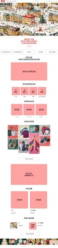
Campaign
Two to three campaigns went live each month, and my team worked closely with the programmers to ensure their execution.
-

Live
A live feature showcases new item styling every day at 1 PM. It’s essential to ensure that the live page links correctly to the PHP.
-

Email
The emails were scheduled for the upcoming 7 days using a timer. It is mainly done through the email platform Radica, with internal image assets linked and completed using HTML.
-

PDP
Collaborate closely with the product team to verify item availability, highlight key product features and tags, and promptly remove sold-out items from the website and app.
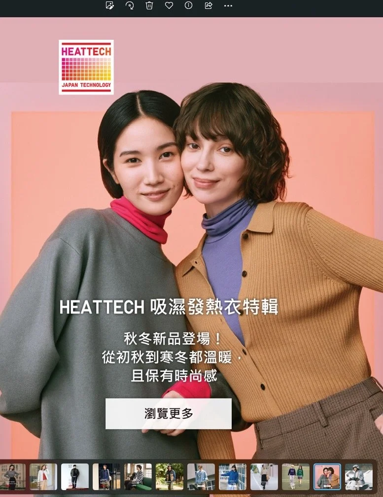
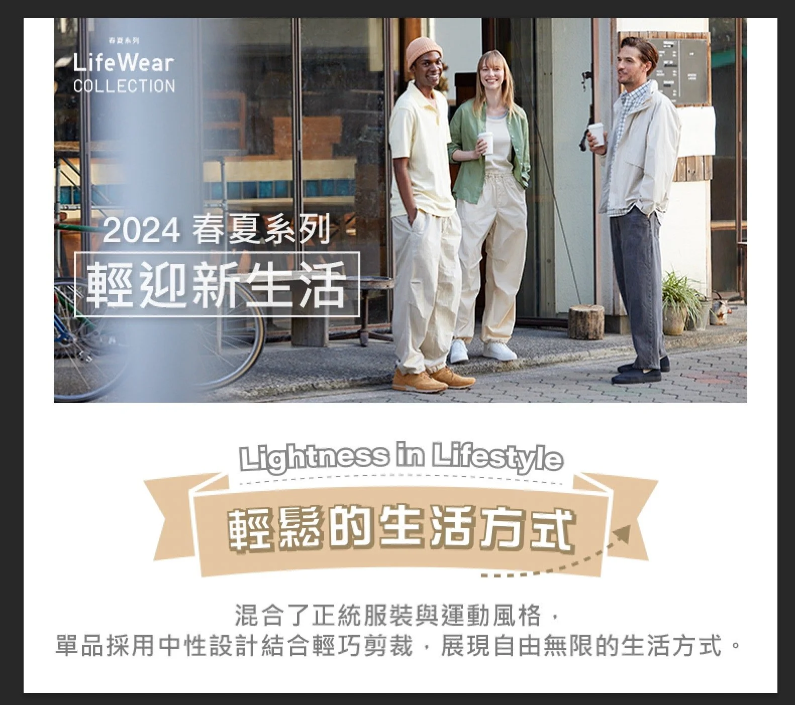
Home Page
Hero Images
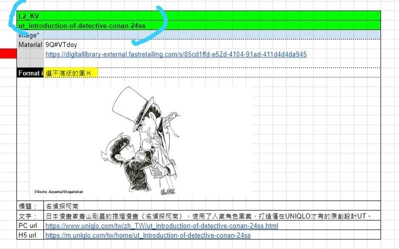
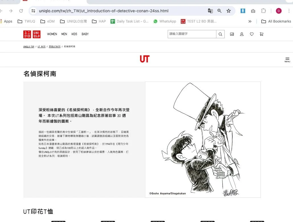
The homepage primarily showcases new weekly item arrivals and the latest collaboration collections. Each week, after receiving the wireframe, I communicate directly with Uniqol partners to review the layout and offer suggestions for improvement. Once approved, our team proceeded with building both the English and Chinese versions of the page, ensuring proper implementation of margins, logos, buttons and content.
I was responsible for communicating with the client and creating responsive versions for both web and app platforms. After development, I conducted thorough end-to-end testing, including link verification and performance checks.

Genders and Feature
Campaign
The Women, Men, Kids, and Baby category pages were updated weekly in alignment with the homepage content. Two to three campaigns went live each month, and my team worked closely with both the programmers and the product team throughout the process.
My main responsibilities include creating wireframes and designing the app version of each campaign page. Once the demo is approved, my teammates handle the PC and H5 responsive interfaces, while I collaborate with the programmers to conduct multiple rounds of testing and refinement.
After confirming the web pages, I proceed to design and implement the app interface, ensuring consistency and responsiveness across all platforms.

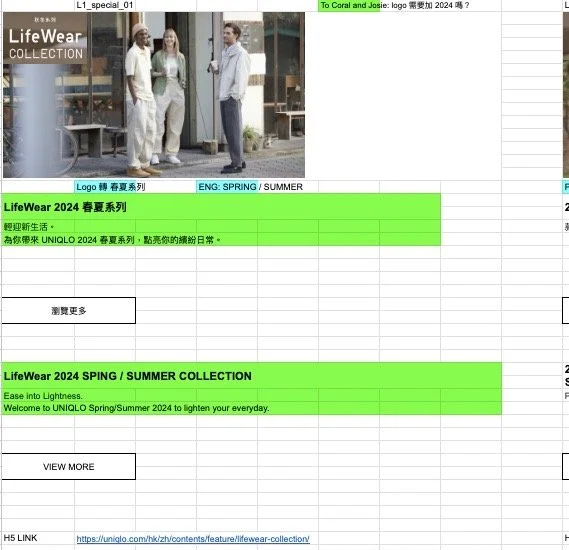
Wireframe
PC - Chinese

PC - English
Wireframe
H5 - Chinese
PC - Chinese
APP
Process of Hero & Campaign
The process was recurring every week.
STEP 1
Meeting
We held a Zoom meeting with Uniqol partners to identify the needs of the next content.
STEP 2
Site Guideline
We received a site guideline for each tailored to meet unique needs.
STEP 3
Wireframing
We created wireframes for the programmer and designer to ensure the page content and functionality were positioned correctly.
STEP 4
Production
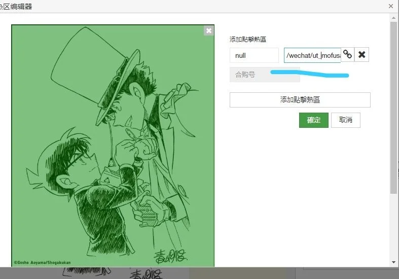
I inspected all the image sizes and details. We ensure the content is correct before the programmer produces the interface using HTML/CSS.
STEP 5
Testing
We produced the test pages and sent them to the client. They would get the comments back the next day.
Step 6
Revising
We conducted the revision based on their comments to create the 2nd test page or 3rd test page.
Step 7
Produce APP
I proofread the content was synced between the interface of PC & H5. After that, I would produce the APP interface.
Step 8
Launch Site
We used some tools that tested across a bunch of pages before publishing.
New Items
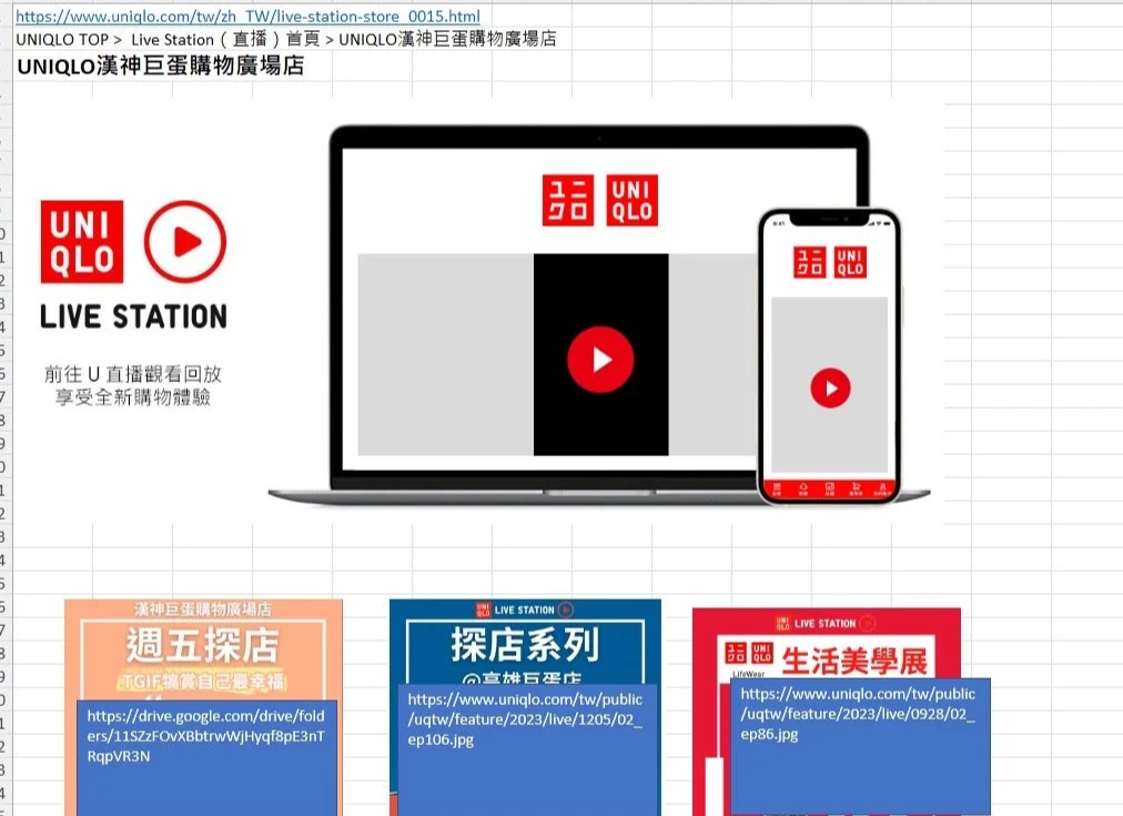
Live Station
Uniqlo hosts daily official live streams, designed to engage directly with customers and drive sales, making them a key component of the e-commerce strategy.
Through the live station, audiences can not only watch live styling sessions but also seamlessly navigate to the PDP (Product Detail Page) to purchase items featured in the stream, often with limited-time offers.
This approach was developed through collaborative discussions during our internal strategy meetings. It provides customers with a more interactive way to explore products in real time, while the urgency of exclusive deals encourages quicker purchasing decisions and enhances overall audience engagement.


Radica & HTML
EDM (Email)
Uniqlo sent daily emails to subscribers, and I created several templates to ensure a consistent layout and design across all communications.
Each template is designed to accommodate various content needs, such as new items, features, or limited-time offers, while maintaining a cohesive brand identity. Our team customizes the emails using Radica and HTML, which allows us to make efficient updates as needed.
Guideline
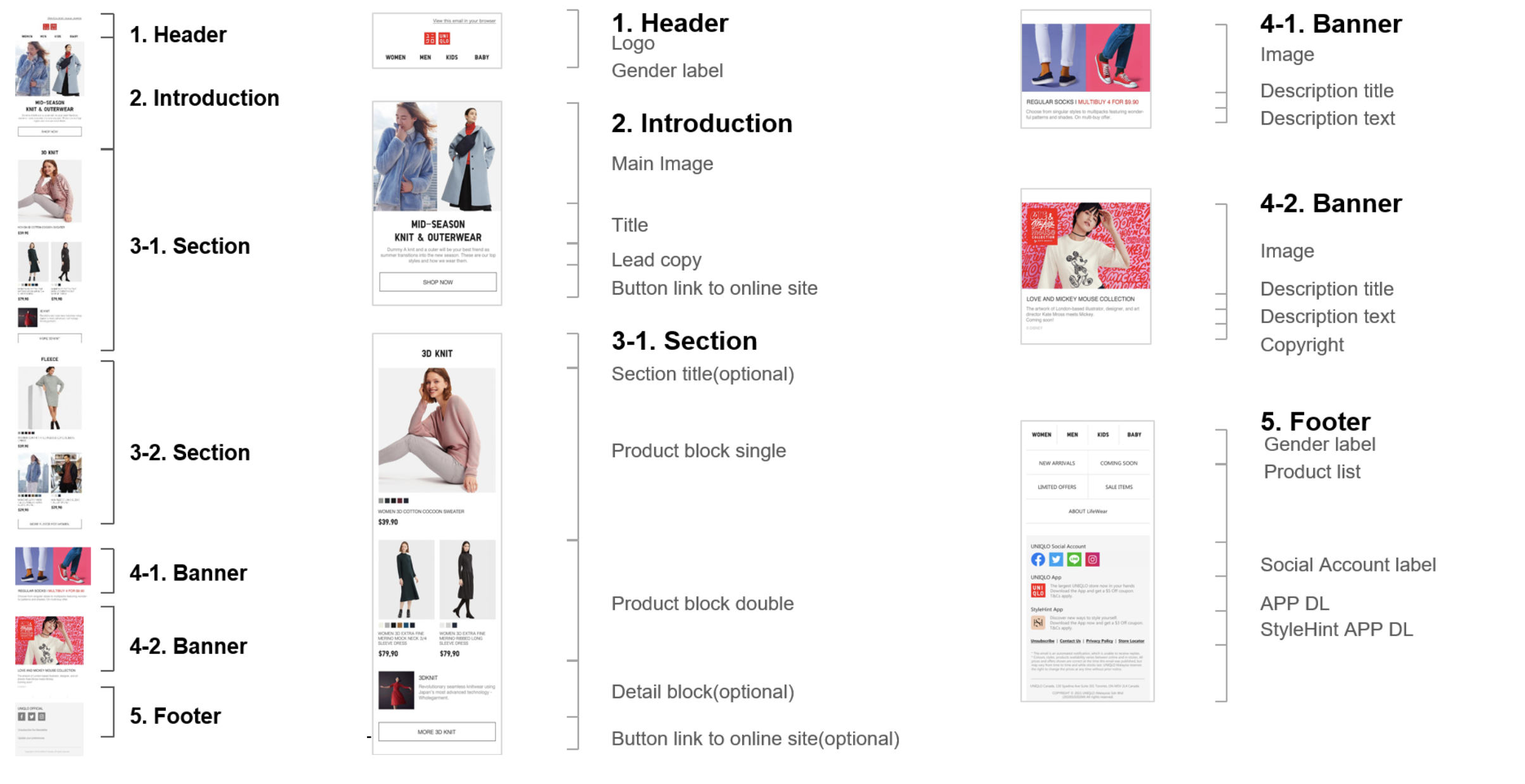


New Item


Feature


Limited offer
PDP Interface Optimization
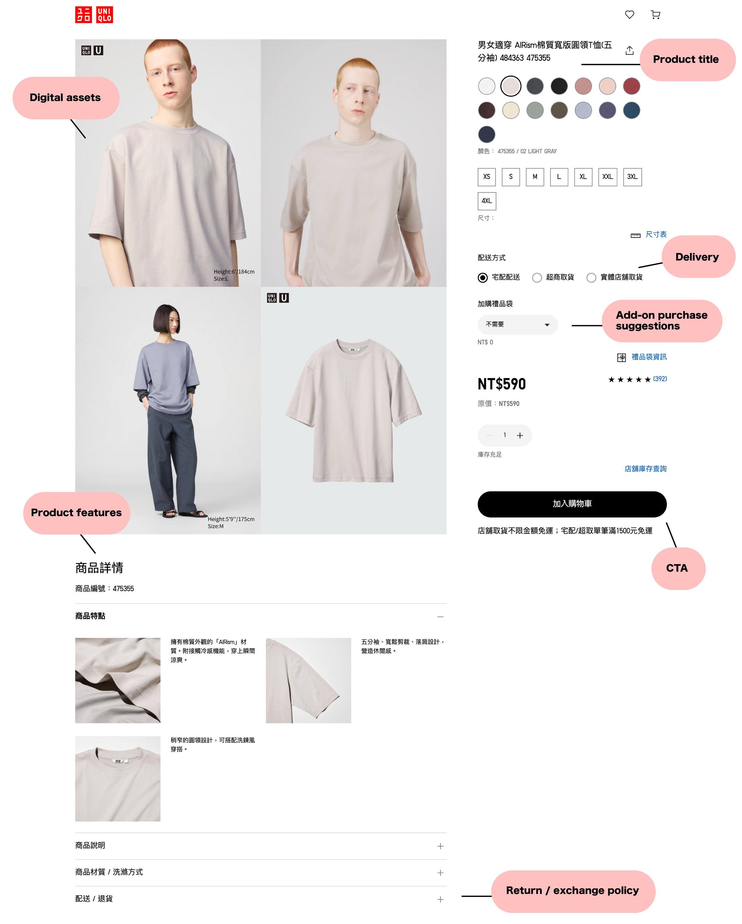
Product Detail Pages
Responsible for the interface design and performance, our focus was on optimizing the visual design and page loading speed of the Product Detail Page.
The UNIQLO PDP follows a conventional layout similar to other major fashion brands. It typically includes:
Product images and videos
Color chips
Size selection
Delivery options
Add-on purchase suggestions
Product features
Styling examples
Customer reviews
Return & exchange policies
Challenges:
Due to the large volume of SKUs and color variations (often exceeding 15 options per item), the PDP can quickly become data-heavy. This directly impacts page load times and overall user experience, particularly on mobile networks or lower-end devices.
Our Goals:
Streamline content presentation to reduce visual and cognitive load
Optimize all image assets to stay under 120KB without sacrificing quality
Maintain a visually clean and functional layout
Improve speed performance without compromising essential product information
Results:
Successfully implemented a responsive, lightweight interface across multiple PDPs
Improved load speed performance and user engagement metrics
Established scalable design and image optimization standards for future product launches

NAVIGATION
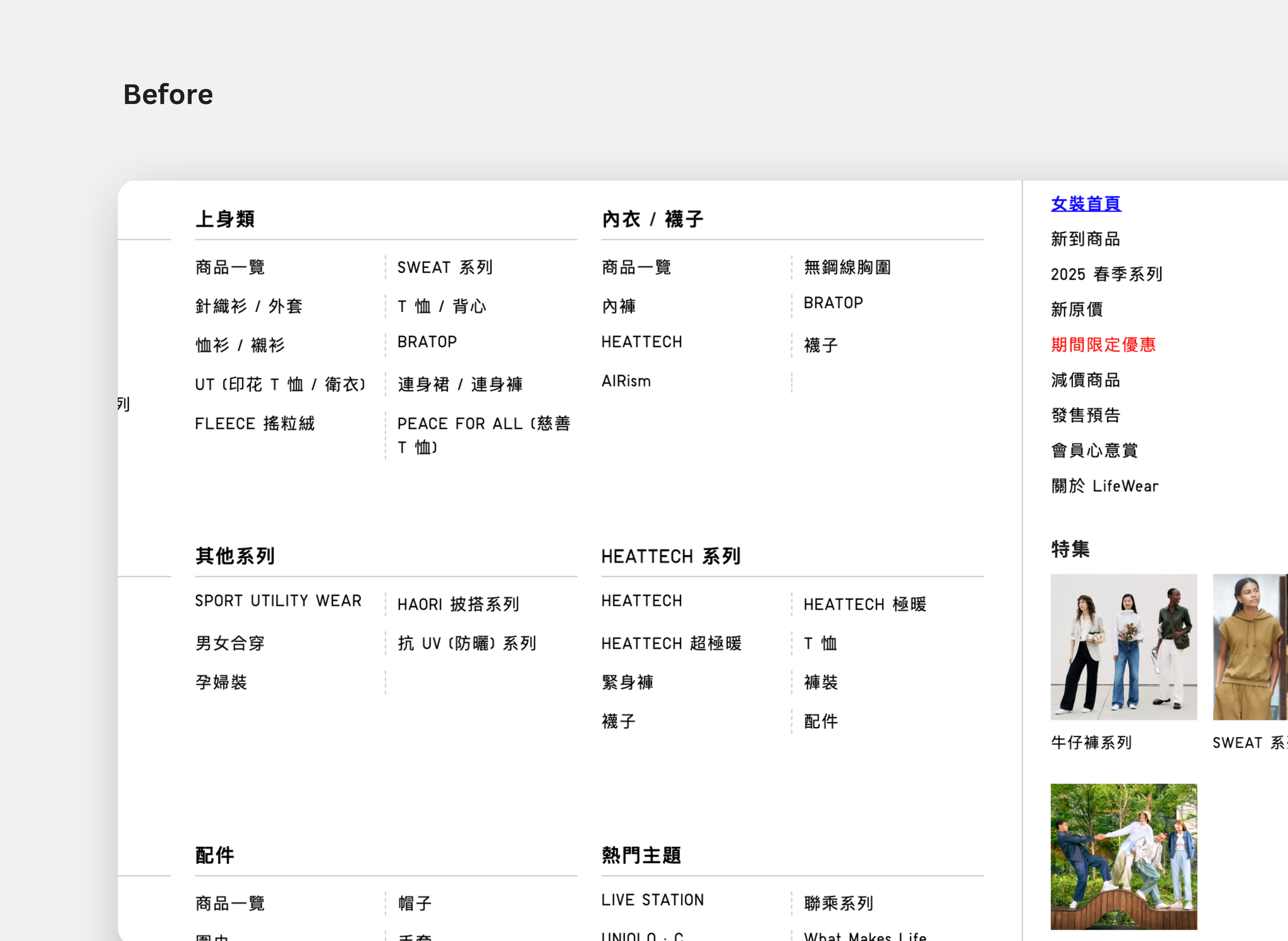

Improved IA and Labelling Acheives 85% Task Completion
Previously each navigation header had two to five subheadings, leading to only 45% task completion during tree testing. We increased task completion to 95% after adding more sub-headers and improving label names.